Last Updated on 2021-09-23
I used to make websites with WIX or Weebly and even built this RexyCafe with WordPress. It doesn’t matter what application you use, RWD(responsive web design) is very important because statistics have shown people are browsing websites through mobile devices more often than desktop. If UI / UX isn’t good for the readers, they will leave and stop reading your blog or browsing your website.
One thing web developers encounter is that you don’t know how it looks on all kinds of different mobile devices. Even WIX and WordPress provide the “mobile” mode for you to check how it will adaptive to different sizes of phones and tablets. However, it’s not always 100% precise and correct.
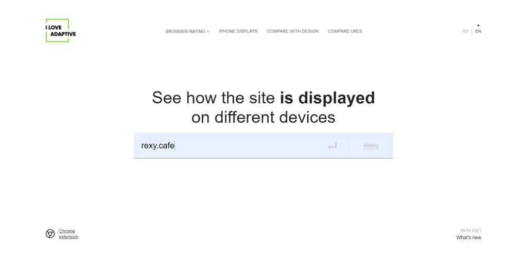
I Love Adaptive
http://iloveadaptive.com/
This nice handy tool will help developers to make sure that RWD is working properly on EVERY SINGLE DEVICE. It not only saves developers time to find real devices for testing but is also quite easy to use. Without further ado, Let’s get on it.
Instruction
step 1
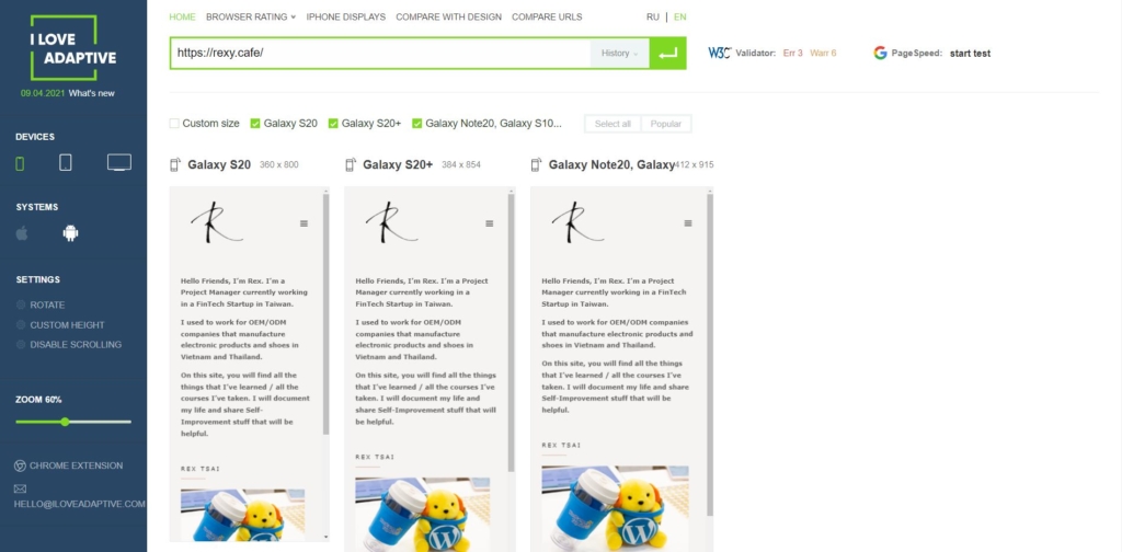
Open I Love Adaptive website and enter your URL.
step 2
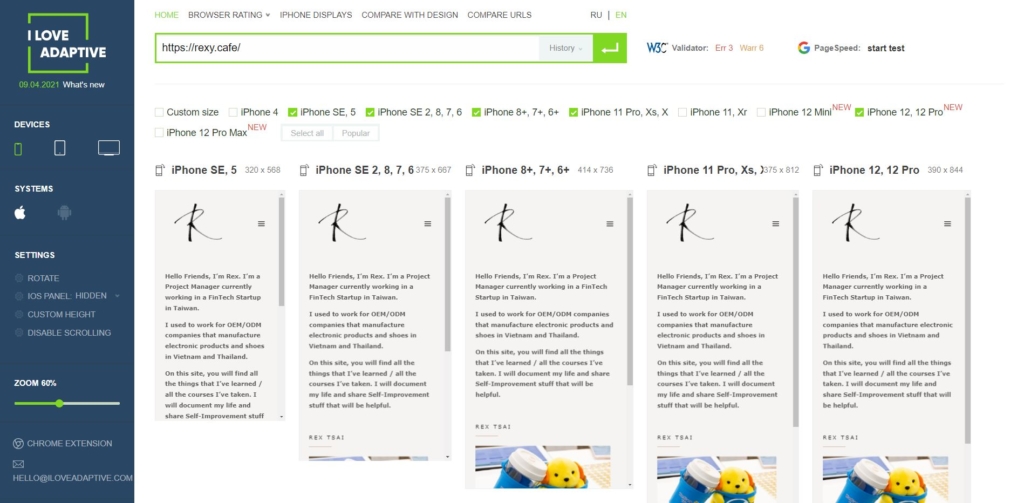
Wait for a minute, you will see the default setting of the common iPhone sizes.
step 3
If you would like to see how it works on Android devices, just click the icon next to the Apple sign.
step 4
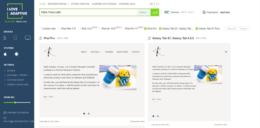
Under DEVICES, click the middle icon and you will see the common tablet such as iPad mini, iPad Pro.
Voilà ! Now you have checked all the devices’ RWD(responsive web design) web design. Congrats !!
Quick Recap :
1. Free and no registration required
2. It has all kinds of devices and sizes
3. Support custom size